Contrary to popular opinion, we shouldn’t believe everything we read online. Even simple tasks such as counting dividends are often mishandled by our internet overlords.
Mainstream financial websites such as Yahoo! Finance and Google Finance should know better. Check out the misinformation they are spreading about our beloved PIMCO Dynamic Credit & Mortgage Income Fund (PCI).
We added PCI to our Contrarian Income Report portfolio five years ago. If you bought PCI then, you’ve enjoyed $12.19 in dividends off an initial entry price of just $18.42. That’s a 66% “cash return” on our investment already!

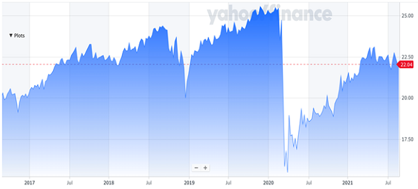
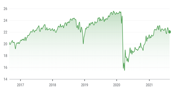
But the charts provided by Yahoo and Google lost track of these dividends. Check out their faulty 5-year reporting:
Yahoo and Google Display Price Only (What’s the Point?)


I’m sure their engineers would explain to us that these charts are “price only.” Fine, but if we’re not tracking total returns—PCI’s payouts in addition to its price appreciation—then what’s the point? That’s a rough way to live.
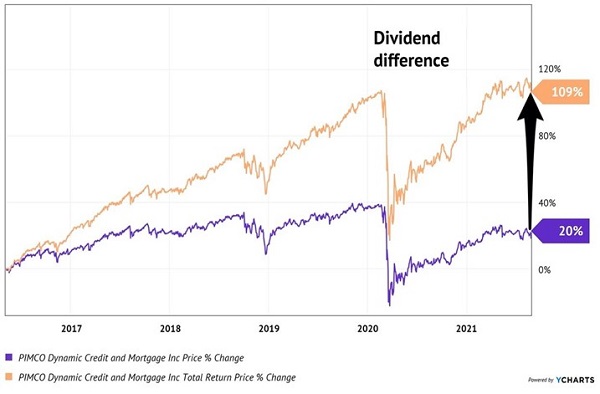
This fund has rewarded us with 109% total returns since we added it to our CIR portfolio in May 2016. The sweet monthly dividends have been the main driver of these riches.
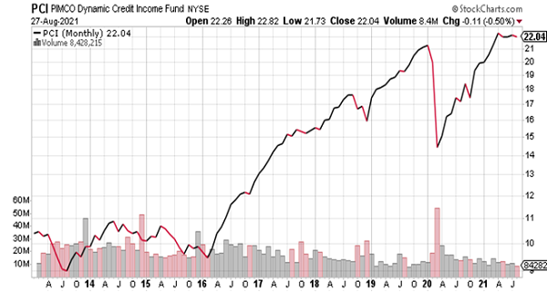
So, we prefer a smarter site like StockCharts.com, which properly accounts for payouts by subtracting them from past price levels. This is a more accurate rearview mirror look at income investing and a better way to live the retired life:
StockCharts.com Adjusts Past Price Levels Properly

Most of the charts that I pepper you with are produced with data from YCharts.com. This is a web-based application that has hooks into all sorts of financial numbers. As income investors we focus on the Total Return calculations provided by YCharts, which reflect price appreciation plus dividends paid.
Here’s a YCharts “split screen” of the two sides of PCI. The lower line, Price, is looking at the fund’s price-only gains (a la Yahoo and Google). The upper line, Total Return, is where the party is at. These are the cash returns we’ve received that are invisible to other investors who don’t know any better:
Our Contrarian Edge: Counting the Cash

Believe it or not, we contrarian income investors have an edge over others because we count the cash. It sounds simple, but two of the most popular websites in the financial world don’t do it. Which means the biggest dividend payers manage to fly under the radar because most investors believe they are “dead money.”
Ha! Their miscalculation is unfortunate for them, but ideal for us. It provides us with the opportunity to buy generous dividend payers at bargain prices.
As you’d imagine, the biggest “contrarian income edge” can be found with the monthly dividend payers. These income machines are throwing off lots of cash every month. And somehow, it isn’t being counted by most investors. So, these stocks and funds look like dead money to the untrained eye.
We’ll gladly take the other side of that big accounting error! Thanks to this incredible collective oversight, these dream retirement investments pay dividends every month. Over the course of a year, these yields can add up to 7% or better in cash returns alone.
And when we consider the price upside that Yahoo and Google are solely reporting, we’re into double-digit total returns. Talk about ideal retirement plays! We can collect 7% dividends, leave our principal untouched, and watch our nest egg grow, too.
Want the details? Please click here and I’ll share my favorite monthly payers to buy right now.

Recent Comments