
I saw an interesting tweet the other day—someone commenting on how lots of people have no qualms racking up $100,000 in debt to get a university degree but think putting $5,000 into the stock market is too risky.
The foolishness of this thinking is evident to anyone familiar with the stock market. Five-thousand dollars in a bland S&P 500 index fund like the SPDR S&P 500 ETF (SPY) would now be worth $12,175 after just a decade. That’s a lot of money to give up on just because of fear!
And don’t be fooled: this kind of thinking isn’t prudence. It’s fear. People who avoid putting money in the stock market do so because they’re afraid that something like the 60% decline of 2008–09’s market crash (the biggest meltdown in 80 years, by the way) will happen again.
For those familiar with psychology, this thinking is familiar: it’s a mix of the loss-aversion fallacy (people’s tendency to avoid small losses more than they will seek big potential gains) and recency bias (the tendency to assume things that happened recently are more likely to happen again, just because they happened recently).
Instead of trying to convince you that this thinking is wrong, I’d instead like to explain how the media encourages this mindset—and how you can spot it. Then I want to show you how it can cost you a lot of money.
How a Simple Chart Switch Dupes Millions of Investors
There is a strong tendency among many news outlets—some mainstream, some not so much—to make bold pronouncements about the future, even when they don’t have the data to back it up. And since fear gets attention, which is what these outlets need to earn a profit from selling ads, these pronouncements tend to be bearish, if not apocalyptic.
To make matters worse, it’s easy to use charts to make these bearish pronouncements look like they are backed by data, even when they are not. The most common trick is also one of the easiest: use price-return instead of total-return charts.
Before I give you an example, let me explain the difference. The price return measures the return of a stock or index based solely on the change of its market price. The total return measures the return based not only on its market price but also with dividends factored into the equation.
Even with the S&P 500, which yields a paltry 2% or so most of the time, this is a very big deal. Those dividends add up over a period of years, and ignoring them gives you a skewed and inaccurate picture of how stocks actually performed.
One of the greatest permabear stories brought out to scare people into avoiding the stock market is that, from 2000 to 2012, the market was essentially flat. And you can demonstrate this with a price-return chart like this one:
A Flat Market—According to One Story
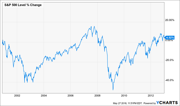
Since the market price of the S&P 500 is reported daily, people are trained to focus on this kind of metric anyway, so regurgitating it doesn’t even seem deceiving.
However, it really is.
Let’s take a look at how the S&P 500 performed on a total return basis compared to just the price return over the same time period:
Not So Flat Anymore!
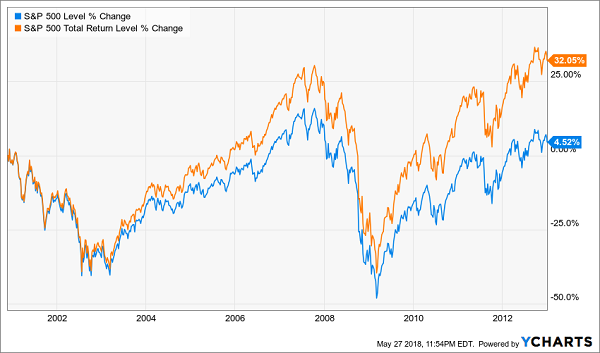
The real story is quite different! Admittedly, 32.1% is a poor return over a decade, partly because the market was facing a tough comparison against the dot-com bubble—which was an even crazier bubble than the housing bubble that followed it—but it’s a much better return than 4.5%.
And for long-term investors, this distinction is crucial. Look at how the S&P 500’s price return compares to the total return from 2000 to today—it’s nearly half!
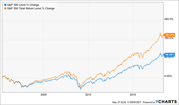
Price Return Tells the Real Story
The Price-Return Fallacy on Steroids
I like to call this obsession with price returns, and the wrong conclusions it leads to, the “price-return fallacy.” And while it’s important when it comes to the stock market, it becomes much more important when talking about higher-yielding investments.
When it comes to closed-end funds (CEFs), this thinking is toxic. The reason? Many CEFs are designed to have a flat or even declining market price while also paying dividends of 7% or more. As a result, CEFs’ price-return charts are even more misleading than those of the S&P 500.
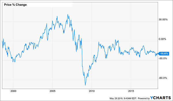
Let me demonstrate this with a high-yield example: the PIMCO Corporate & Income Opportunities Fund (PTY), which specializes in corporate bonds and bond derivatives, uses leverage and focuses on paying out a high income stream to shareholders—it currently pays a 9.2% dividend.
I mention these aspects of the fund because I’ve heard dozens of financial professionals—CFA charterholders, financial advisors, star financial bloggers and financial journalists—decry PTY or funds like it as dangerous investments that provide a low return over time. When I asked one advisor to explain this view, he told me to look at the price-return chart for PTY over the last decade.
PTY’s Unappealing Price Return
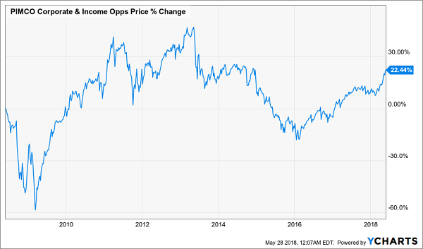
A 22.4% gain isn’t good, especially since the S&P 500 is up 96.4% over the same time period.
But again, this is the price-return fallacy. Now let’s add dividends to the mix and see what happens.
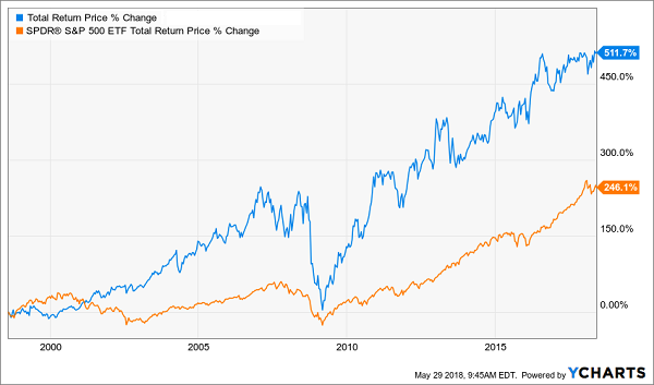
A Meteoric Rise
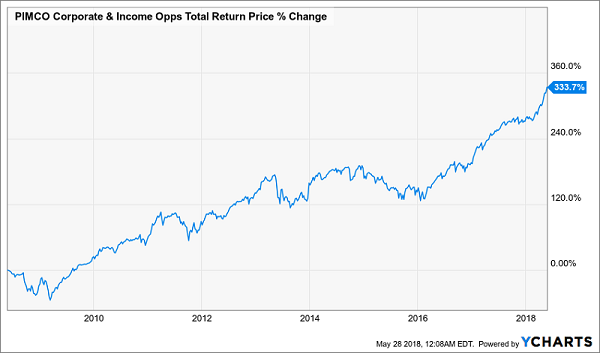
A 333.7% return is very different from 22.4%! Also, you’d be pleased to know that PTY’s 333.7% total return over the last decade is over twice as big as the S&P 500’s 143.7% total return over the same period.
Those financial advisors who warn against PTY and funds like it are costing their clients money. And their clients are getting fooled because they’re getting duped by the price-return-chart fallacy. Don’t be like them—always look at total returns.
4 “Off the Charts” CEFs to Buy for 8.0% Dividends and 20% Gains
If you went by price charts alone, you’d easily miss my 4 top CEFs to buy now.
Consider my No. 1 pick of this “4 pack,” which pays an 8.0% dividend as I write. This sturdy fund, which invests in high-yield real estate investment trusts (REITs) has crushed the S&P 500 since inception, but you’d never know it from the price chart:
A Winner in Disguise
But when you add its rock-solid 8.0% cash dividend back in, you get a completely different story: a 512% return that more than doubles up the market’s gain—in CASH!
Dividends Drive an Easy Double
The kicker: this fund provided a higher return than the stock market even when you factor in the subprime mortgage and Great Recession. And it did it by investing in real estate, the very thing that caused the crisis in the first place.
PLUS they pulled off that stellar performance while paying a dividend of more than 7% the whole time. Right now, its payout is a hefty 8.0%.
If that’s not the definition of a well-run fund, I don’t know what is.
But the funny thing is, this fund is trading at a 1.5% discount to its net asset value (or what all the holdings in its portfolio are worth right now). That’s absurd when you consider that this one traded has traded at premiums as high as 16% in the last few years.
I can’t wait to give you all the details on this battle-tested income play and the 3 other CEFs I’ve hand-picked as your very best buys for 8%+ dividends and 20% upside in the next 12 months. CLICK HERE and I’ll give you the names, tickers, buy-under prices and complete details on all 4 of these “undercover” CEFs now.
Recent Comments