
You know the old saying, “There are lies, damned lies and statistics”? Here’s another one for you: “There are lies, damned lies and charts.”
That certainly applies to the 8.6%-paying fund I’ll reveal toward the end of this article. If you looked at its price chart alone—which almost everyone does—you’d totally miss it!
And this dividend passes my 3-point “dividend safety check,” which I’ll also give you a little further on.
The Trouble With Stock Charts
The truth is, too many pundits have a point they want to prove, and they choose charts that prove that point. In some cases, they use charts that only tell half the story. This is common when it comes to looking back at returns an asset has delivered over a long period.
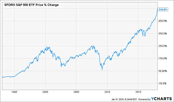
Let’s take the most common chart used—the return of the S&P 500 over a long time horizon. All too often, people use the price chart for an index fund like the SPDR S&P 500 ETF (SPY) to calculate that. And the answer becomes this: since 1993, when SPY was issued, it has given investors a 544% return.
A Pretty Good Run…
That chart isn’t telling the whole story. Remember that the S&P 500 pays out dividends—and this chart doesn’t include the gains from those cash payouts. Add dividends in, and suddenly SPY’s total return from 1993 is 931.2%—nearly double the return on price alone!
… But Not as Good as This!
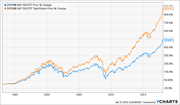
If we’re talking about an original investment of $100,000, we’re talking about a difference of $387,200. That’s a lot of money!
That’s why I always encourage investors to take a close look at the total return of their investment—not just the change in price. The longer the time horizon, the more important this becomes; see how the gap between the blue and orange lines above gets wider over time? When you talk about long-term investing, this distinction between total return and price return is massive.
And when we talk about other investments (like that 8.6% payer I mentioned off the top) and different time horizons, the difference between these two becomes even more important.
Since a lot of investors are not taking a look at this simple metric, it causes a lot of market-beating investments to be massively underpriced.
Let me explain with an example.
The Market’s Folly
I want to show you the price chart of one of my favorite closed-end funds (CEFs), a fund I first recommended to members of our CEF Insider service in March 2017. Pull up a price chart of this CEF, and it looks like I made a huge mistake:
A Bumpy Ride and a Low Return?
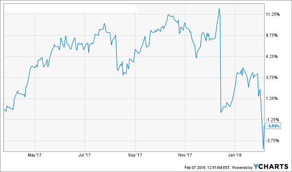
Just a 3.6% return in nearly year—and a year when all markets around the world are going gangbusters? Looks like a big mistake! And what about that huge drop in December? Looks dangerous! But let’s look at a total return chart of the same fund over the same period:
Not Exactly! Massive Returns and a Steady Climb
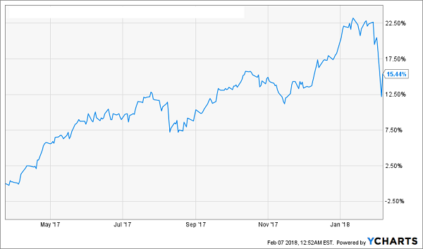
In fact, not only did this fund slightly beat the S&P 500, but it did so while paying a 7.5% dividend yield, which is over four times higher than the awful 1.7% the S&P 500 pays out.
See how charts can be deceiving?
What to Really Look For
There are three things you should look for in any investment, particularly a CEF (if you’re unfamiliar with CEFs, click here for a full primer on these powerful income plays).
- Total returns;
- Stable or Growing net asset value (NAV, or the market value of a fund’s underlying portfolio); and
- Cash flows that match your investment goals.
The longer the time horizon and the bigger the dividend yield, the more important total returns are.
To demonstrate this, let’s dive into the Columbia Seligman Premium Tech Fund (STK), the CEF that yielded a whopping 13.6% in the past year thanks to a huge special dividend (it currently throws off a nice 8.6% payout for 2018, but a special dividend at the end of the year could kick that up a bit) and has returned 13.1% per year since its IPO in 2009.
Since the yield (particularly over the last year) is roughly the same as the annual return, we can expect STK’s market price to more or less stay flat in the future, but we’d still get a nice return on our investment because of the big dividends.
And that’s been STK’s story:
Big Returns, All in Cash
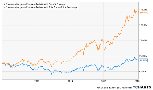
By looking at the total return (step 1), we know that this fund provides a good return and is likely to do so in the future.
Now for step 2: the NAV. Since STK has a history of high dividend payouts, can it continue to pay out that hefty income stream without eating into the value of its portfolio?
Since its IPO, it has done exactly this.
Solid Portfolio Easily Supports Dividend
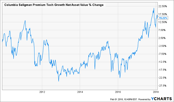
This isn’t an accident; when Columbia first released STK, its goal was to keep the fund’s NAV more or less stable and give investors a reliable income stream by making savvy tech investments. And for nearly a decade, STK has done just that.
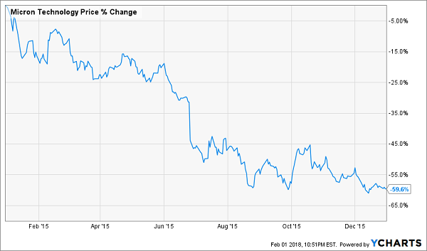
That leads to our third consideration: our income goals. STK’s biggest holdings are Lam Research Corp (LRCX), Micron Technology (MU), Apple (AAPL) and Broadcom (AVGO). On their own, these four stocks make up over a quarter of the fund’s total assets. But you would be better off with STK over holding these stocks individually to meet your income goals.
Consider this: these four stocks pay an average dividend yield of just 1.2%, meaning a $100,000 investment gets you a measly $100 per month in passive income. Sure, that will grow over time, but what about right now?
Meanwhile, STK’s massive yield means $100,000 in this CEF gets you $1,133 per month in income, over 10 times as much as you’d get from buying these stocks yourself. Oh, and you don’t have to worry about constantly buying and selling with the ups and downs of the market—STK’s managers will do that for you.
Still, some investors will insist on buying these 4 stocks individually and boosting their 1.2% yield by selling them gradually over time to make up for the low dividend. The biggest problem with this is that you may be stuck selling your shares to cover your income goals when the stocks are down. Imagine being forced to sell Micron in 2015, when it did this:
Want to Sell Now?
…and then seeing your smaller portfolio of MU shares recover when the stock did this the very next year:
Imagine Selling Right Before This!
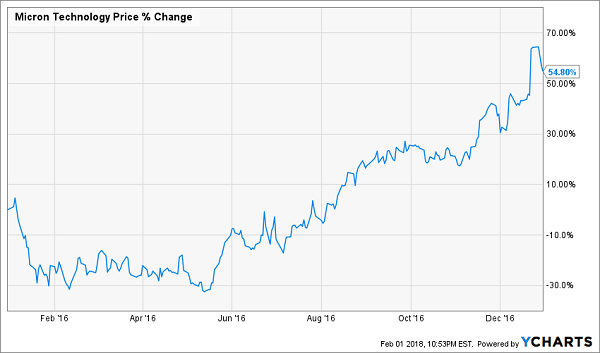
With a closed-end fund such as STK, you’ll never be in that situation.
The bottom line? Not only is investing in a CEF often easier than buying stocks individually, it can help you meet your investing goals without being forced to sell your stocks at a loss.
This 10.4% Dividend Is a Screaming Buy!
Before I sign off, I want to show you one of my very favorite buys for 2018. It boasts a much higher current yield than STK—a safe 10.4%—but if you looked at the wrong chart, you’d miss out on it entirely.
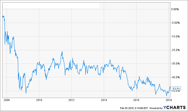
I’m talking about its price-only performance since inception:
An Undercover Winner
Now let’s add that massive dividend payout back in:
Dividend Makes the Difference
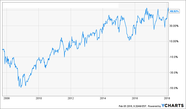
That’s a massive change—from a 53% loss to a 49% GAIN! And keep in mind, that return was all in CASH. Just imagine what a payout like that could do for your retirement.
Funny thing is, even after that big gain, this cash machine—whose rock-solid portfolio is anchored by some of America’s safest blue chip stocks—still trades at a BIG discount to NAV—or its “true” value!
The bottom line? We’ve got plenty more upside left to go along with that life-changing 10.4% dividend. But most folks have no idea! They simply look at the price chart I showed you earlier and run the other way.
That’s our cue to buy with both hands NOW.
I’ll show you all the details on this fund and my 3 OTHER favorite CEFs to buy now when you CLICK HERE.
Throw them all in their own “mini-portfolio” and you’re looking at a safe—and growing—8.1% average payout and, thanks to their silly discounts to NAV, easy 20%+ upside in the next 12 months!
The whole amazing story is waiting for you. Simply click here to get these 4 funds’ names, ticker symbols, buy-under prices and my complete research on each one now.
Recent Comments